
In the world of marketing, color is more than just a visual element—it’s a powerful psychological tool. Colors can influence mood, evoke emotions, and even drive purchasing decisions. Understanding the psychology behind color choices is crucial for designers, especially when creating posters that need to capture attention and convey messages effectively. This comprehensive blog post delves into several case studies that illustrate the significant impact of color psychology in poster design, offering insights into how strategic color use can enhance marketing efforts.
Understanding Color Psychology
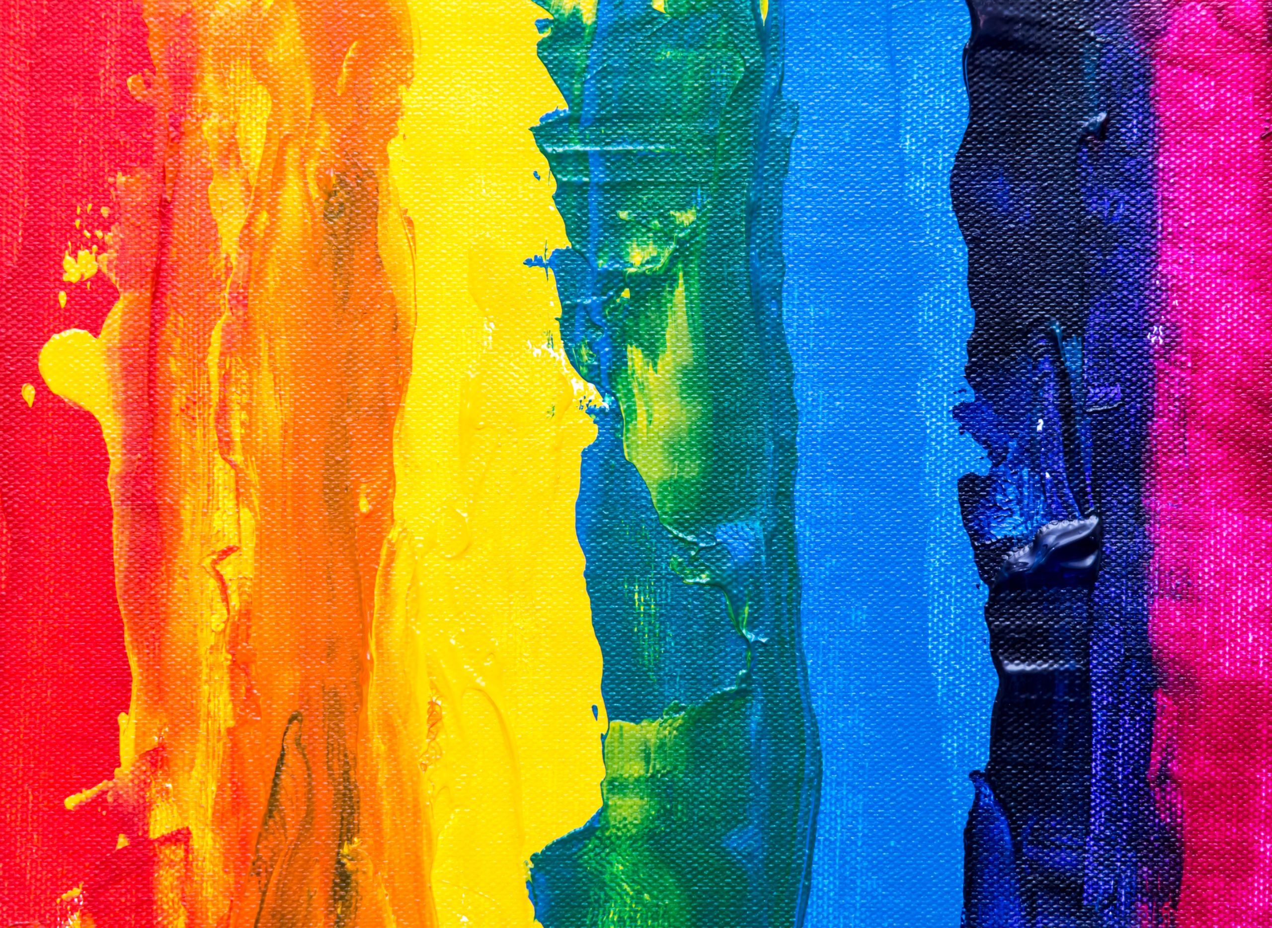
Before we explore the case studies, it’s important to understand the basics of color psychology. Colors are perceived in different ways based on cultural, personal, and situational contexts, but some general associations are commonly accepted:
- Red: Energy, passion, excitement, urgency.
- Blue: Trust, calmness, professionalism, reliability.
- Green: Nature, health, tranquility, abundance.
- Yellow: Happiness, optimism, youthfulness, attention-grabbing.
- Orange: Creativity, friendliness, enthusiasm, warmth.
- Purple: Luxury, mystery, spirituality, royalty.
- Black: Sophistication, elegance, formality.
- White: Purity, cleanliness, simplicity.
With these associations in mind, let’s explore how different organizations have used color psychology in their poster campaigns to influence audiences.
Case Study 1: Fast Food Industry Campaign
Background
A prominent fast food chain launched a new poster campaign to promote a limited-time offer. The campaign was aimed at stimulating quick decision-making and driving immediate sales increases.
Strategy
The designers opted for a dominant red color scheme with touches of yellow. Red was chosen for its associations with energy and urgency, which are ideal for prompting quick decisions and increasing appetite. Yellow was used to draw attention and evoke feelings of happiness.
Outcome
The campaign resulted in a 23% increase in sales during the promotion period. The bold red color not only caught the attention of passersby but also created a sense of urgency that complemented the limited-time offer.
Lessons Learned
This case study demonstrates how the strategic use of red in food-related advertising can effectively stimulate appetite and encourage impulse buying.
Case Study 2: Financial Services Campaign
Background
A financial services company needed a poster design to promote its new savings account that offered a higher interest rate, aiming to attract a more conservative, older demographic.
Strategy
The design team chose a palette of blue and green. Blue was selected for its psychological associations with trust and reliability—crucial for financial services—while green was used to signify growth and financial prosperity.
Outcome
The campaign experienced a 30% increase in new account sign-ups compared to previous campaigns. Surveys suggested that the color scheme had a calming effect on viewers, making them more likely to trust the brand with their savings.
Lessons Learned
This example highlights how blue can be effectively used to evoke feelings of stability and trustworthiness, critical in industries where trust is a fundamental concern.
Case Study 3: Health and Wellness Campaign
Background
A health and wellness center introduced a new line of eco-friendly wellness products and wanted a poster to reflect the natural, healthy attributes of the products.
Strategy
The poster utilized various shades of green to emphasize the natural qualities of the products and promote a sense of tranquility and health.
Outcome
The campaign led to a 40% increase in product sales and significantly boosted brand recognition as a leader in eco-friendly wellness solutions.
Lessons Learned
Green’s association with nature and health effectively communicated the brand’s commitment to eco-friendly products, appealing to environmentally conscious consumers.
Case Study 4: Entertainment Industry Promotion
Background
A movie studio was preparing to launch a new superhero film and needed a poster that would excite and attract a broad audience.
Strategy
The design incorporated a vibrant mix of bold colors, primarily red and orange, to convey excitement and adventure. Purple highlights were used to add a sense of mystery and luxury to the film’s branding.
Outcome
The movie debut was highly successful, setting box office records for opening weekend sales. The colorful, dynamic poster was credited with generating significant buzz and anticipation.
Lessons Learned
The combination of red and orange can be particularly effective in entertainment marketing, where high energy and excitement are essential for attracting audiences.
Case Study 5: Technology Product Launch
Background
A technology company was set to release a new high-end smartphone and wanted the product’s innovation and sleek design to be reflected in the launch poster.
Strategy
The poster featured a minimalist design with a lot of white space and sleek black accents, communicating sophistication and cutting-edge technology.
Outcome
The product launch was extremely successful, with initial stock selling out within hours. The sophisticated design of the poster helped position the smartphone as a premium product.
Lessons Learned
Black and white, often used in high-end product marketing, can effectively convey sophistication and appeal to luxury buyers.
Conclusion
These case studies vividly illustrate how color psychology can be leveraged in poster design to influence perceptions, evoke specific emotions, and drive consumer behavior. By carefully selecting colors that align with the goals of a campaign, designers can significantly enhance the effectiveness of their marketing efforts. As we’ve seen, whether it’s stimulating appetite, building trust, promoting health, or exciting potential customers, color is a powerful tool in the arsenal of visual communication.
If you have any questions about poster printing, please feel free to reach out to us at in**@bu****************.com or submit our contact form. We’re here to assist you in any way we can.

Since 2001 we’ve been printing posters for our friends who were started as our customers. With over two decades of experience, we have been providing top-notch poster printing services for your home, office, or out-of-home marketing campaigns. Our commitment to excellence is evident through our efficient same-day turnarounds. Unlock the possibilities and explore our exceptional poster printing services today.
